In 2026, your mobile store isn't just a version of your website: it is your website. For high-growth fashion brands and streetwear labels, mobile traffic often accounts for over 80% of total sessions. If your site takes more than three seconds to load on a standard 5G or 4G connection, you aren't just losing clicks; you’re literally handing your customers over to your competitors.
Speed is the silent killer of conversion rates. As a leading Shopify agency, we see it every day: beautiful, high-end jewelry or apparel stores that fail to scale because their mobile performance is bogged down by unoptimized assets and "app bloat."
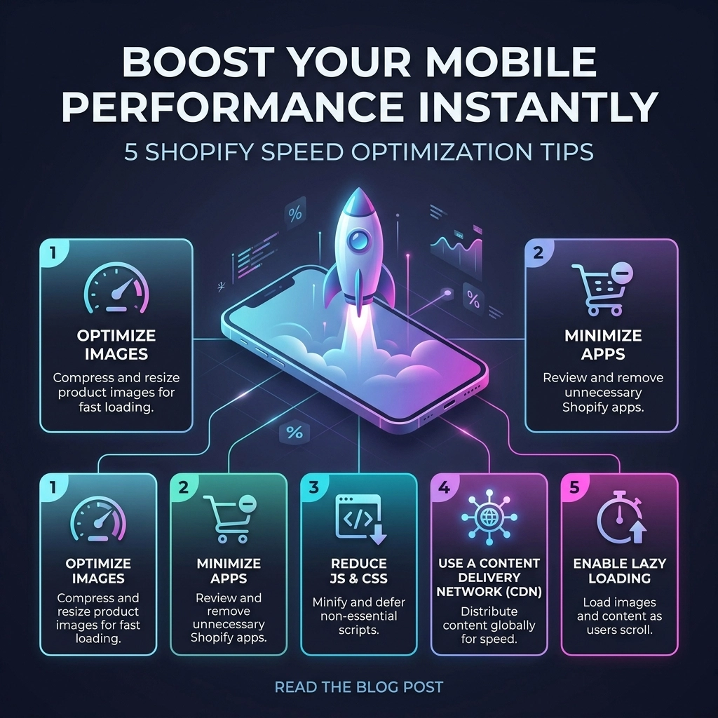
If you want to scale your revenue this year, you need to stop thinking about speed as a "technical chore" and start seeing it as a core growth strategy. Here are five actionable Shopify speed optimization tips to transform your mobile experience today.
1. Radical Image Optimization for Mobile Reality
Images are the soul of any fashion brand. You need high-resolution photography to build trust and showcase detail. However, serving a 2000px wide "Hero" image to a customer on a 400px wide iPhone screen is a waste of bandwidth.
The Strategy: Serve Smaller, Smarter Files
Most brands focus on compression, but sizing is where the real wins are. Using the srcset attribute in your Liquid code allows Shopify to serve different image sizes based on the user's device.
Actionable Steps:
- Convert to WebP: Ensure your theme supports WebP or AVIF formats. These provide superior compression compared to JPEG or PNG without losing quality.
- Manual Compression: Before uploading to Shopify, run your assets through tools like TinyPNG or ImageOptim.
- Crop for Mobile: Don't just resize; crop. A vertical (9:16) image often loads faster and looks better on mobile than a scaled-down horizontal desktop banner.
Key Insight: Refining your image strategy alone can reduce mobile page load times by up to 30%. In the world of Shopify development, this is the lowest-hanging fruit with the highest ROI.

2. Transition to a Performance-First Shopify Theme
Many D2C brands fall into the trap of choosing a theme based purely on aesthetics. They pick a theme with ten different animations, three types of sliders, and a "kitchen sink" of features. On a mobile processor, these scripts battle for resources, leading to a "janky" scrolling experience.
The Strategy: Choose Leaner Architectures
If you are on Shopify Plus or scaling a high-growth brand, consider moving to an Online Store 2.0 theme built for speed, such as Dawn or a custom-built headless solution.
Pros and Cons of Pre-made Themes:
- Pros: Quick to deploy, lower initial cost, easy to customize via the editor.
- Cons: Often contain "dead code" (features you don't use but still load), heavy JavaScript libraries, and redundant CSS.
Pro Tip: If your current theme feels slow, don't keep layering apps on top of it to "fix" things. Sometimes the most cost-effective Shopify speed optimization is a clean migration to a leaner theme architecture.
3. Master the Art of Lazy Loading
Lazy loading is the practice of delaying the initialization of resources until they are actually needed. For a mobile user, this means the browser only loads the images and videos currently visible on the screen ("above the fold").
The Strategy: Liquid-Level Implementation
In 2026, browsers have become much smarter, but you still need to give them a nudge. You can implement native lazy loading directly in your Shopify Liquid templates by adding the loading="lazy" attribute to your image tags.
Why this matters for Mobile:
Mobile devices have limited memory. By only loading what is necessary, you reduce the "Total Blocking Time" (TBT), allowing the user to start interacting with your product filters or "Add to Cart" buttons much sooner.
Key Insight: Never lazy load your "Above the Fold" content. Your main hero image should load immediately (using loading="eager" or fetchpriority="high") to ensure your Largest Contentful Paint (LCP) score remains healthy.

4. Kill the Carousel: Static Hero Images Win
It’s time to face the truth: mobile users rarely slide through carousels. Data consistently shows that the first slide gets 90% of the engagement, while the remaining slides simply slow down your site.
The Strategy: Swap Sliders for High-Impact Statics
A carousel with five images requires the browser to download five high-res assets and the JavaScript required to move them. On a mobile device, this is a performance nightmare.
The Benefits of Static Heroes:
- Lower Request Count: One image means fewer HTTP requests.
- Better SEO: Google prioritizes pages that stabilize quickly (Cumulative Layout Shift).
- Clearer Messaging: You force yourself to put your best offer or most compelling brand imagery front and center.
Pro Tip: Use a single, high-quality static image with a clear "Shop Now" call-to-action. If you must show multiple products, use a mobile-optimized grid or a "Lookbook" section further down the page where lazy loading can handle the weight.
5. Perform a Brutal App Audit and Code Minification
Every time you install a Shopify app: whether it’s for reviews, countdown timers, or social proof: it adds a snippet of JavaScript to your store. Even if you uninstall the app, the code often stays behind, ghosting your site and slowing it down.
The Strategy: The "One-In, One-Out" Rule
Treat your site's code like a high-end fashion boutique. If you want to bring in a new tool, something else has to go.
Actionable Steps:
- Audit Your Scripts: Use the Chrome DevTools "Coverage" tab to see how much of your JavaScript is actually being used.
- Minify Everything: Ensure your CSS and JS are minified (removing whitespace and comments). While many Shopify apps do this automatically, custom Shopify development often requires manual oversight to keep the codebase clean.
- App Consolidation: Look for all-in-one solutions. Instead of five different apps for upsells, reviews, and loyalty, find one robust platform that handles them through a single script.

The Thriftizer Framework for Mobile Growth
At Thriftizer, we believe that speed isn't just about passing a Google PageSpeed Insights test; it’s about the user's journey. We organize our optimization through three pillars:
- Discovery: Can the user find what they want without waiting for a search bar to load?
- Trust: Do high-quality images load fast enough to prove the brand's premium status?
- Intent: Is the "Add to Cart" button responsive the moment a user decides to buy?
Technology should be your co-pilot, not an anchor. Start small, stay creative, and focus on the metrics that actually move the needle for your bottom line.
Challenges to Consider
While these tips offer "instant" boosts, speed optimization is an ongoing process.
- Third-Party Scripts: You can't always control the speed of external scripts (like Meta or Google Ads pixels).
- Feature Creep: Marketing teams often want more features that technical teams know will slow the site down. Balance is key.
Next Steps Checklist
Ready to speed up? Follow this implementation path:
- Analyze: Run your site through PageSpeed Insights and identify your current "Largest Contentful Paint" on mobile.
- Audit: Uninstall any apps you haven't used in the last 30 days.
- Optimize: Compress your top 10 most-viewed images and convert them to WebP.
- Test: Implement lazy loading on your product collection pages.
- Consult: If you're hitting a wall, reach out to a professional Shopify agency to handle the deep-liquid code optimizations.
Never ever think of giving up on your performance goals. A faster store is a more profitable store. If you're looking for expert help to take your fashion brand to the next level, check out our Shopify Expert profile or visit us at Thriftizer to see how we can help you scale.
Start small, stay creative, and watch your conversion rates climb.